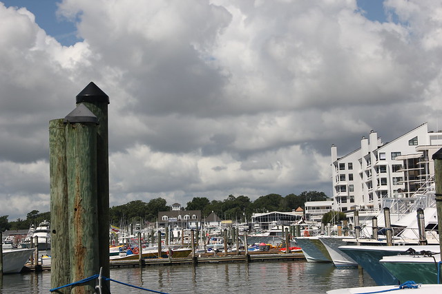
Those of you who read my main blog know that I had the sudden inspiration to edit photos from and post about some things from our Virginia Beach vacation last summer. While editing, I came across this certain lovely landscape. (Below SOOC)
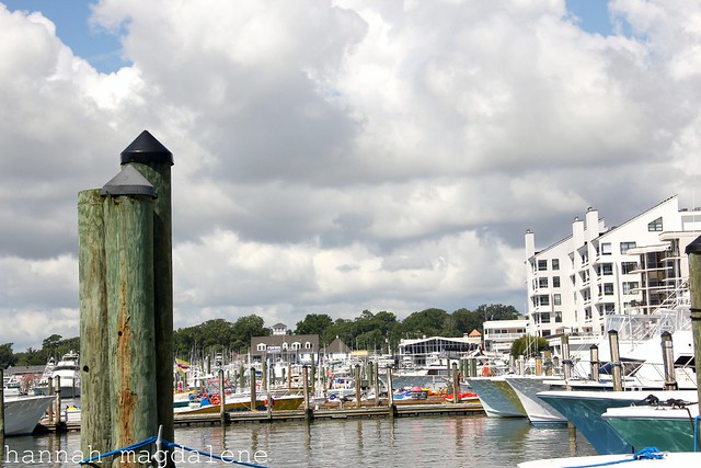
I liked it, although, obviously, it looked rather bland. I uploaded it to Picnik and did this rather basic edit.
Nice, but it needed something...more. It was then that, feeling a bit artistic and odd, I created a this set of edits, working off my original basic edit for the photo. I had lots o fun messing around....Here's my first one, using Cross-Process to a certain extent (I forget what). Mmm, I love this Picnik effect.
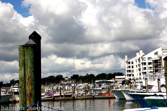
For this, I brough the exposure down and contrast up. Funky, I know.
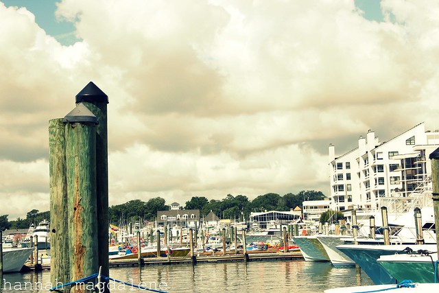
This one consisted of bring the saturation down and the temperature about as high up as it could go. It ended looking sort of old-photograph-ish.
I decided that I needed to revert back to something I knew well at this point. Which brought me to a traditional black and white image. I used my Picnik recipe consisting of using "Boost" after the inicial revert. Because Boost with the strength to 30% (what I wanted) was blowing out some of the clouds up top, I used the eraser brush
I started this edit with the previous black and white and faded the Sepia about 30%.
So now I'm a bit curious...which is your favorite?
And am I the only one who goes on strange editing stints like this sometimes? ;)
love!
hannah m.


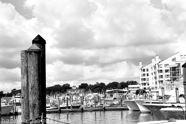
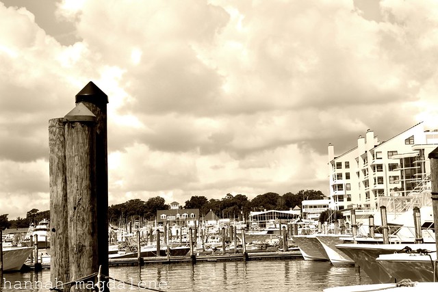
Love the 4th picture! (third edit) Very pretty capture.
ReplyDeleteAll of these edits are awesome.
ReplyDeleteThird picture! :)
ReplyDeleteI love 'em all!
ReplyDeleteLove all the edits! I'm a cross-process junkie, so of course I really liked that one, but I also think the last one looked amazing.
ReplyDeleteI like them all but my favorites are the 1st and cross-process ones. The 1st picture really brings out the background houses and boats. I like the colors in the cross-process one.
ReplyDelete